Web Design Tips
Determine the purpose of the page or post, and think about what your users are expecting to see. What do you want your users to do after reading or skimming through this post or page?
Design isn’t everything, but it’s almost everything.
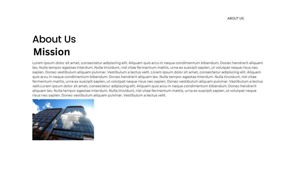
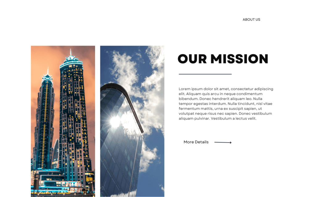
Developing a successful website and content involves careful planning, prototyping, and refining. Simply putting in minimal effort won’t lead to an effective blog or webpage. Creating an exceptional design requires both time and dedication. To excel as a web designer or marketer, it’s essential to invest substantial effort to produce a final product that you’re truly proud of. While design isn’t the only factor, it significantly shapes the user experience. Layouts lacking structure and inspiration won’t captivate users. Therefore, it’s crucial to explore a variety of layouts and content blocks. For instance, the impact of a mission statement on an “About Us” page can be dramatically different with a bit of experimentation.


Give your users a break.
Putting too many things close together on a webpage confuses users. They don’t know where to look, and it makes the website look messy. To fix this, break long paragraphs into smaller ones and use headings and subheadings to organize your writing. If you use pictures or videos, make sure they help explain your message, not just for decoration.
Graphics on a webpage should help users understand the content better. Leave some empty space around your content and make sure everything is well organized. Remember, creating good content takes time and effort. Don’t expect many people to visit your website if you write something that’s already been said before. Make your content unique and interesting to attract more visitors.
Create original elements on your pages, such as infographics, interactive elements, high-quality media, and interesting articles. Link articles to other content on your website and to other reputable businesses or organizations.


Consistent font, and color choices.
Colors
When it comes to designing a website, one of the most important decisions you’ll make is selecting a central color palette. The colors you choose will set the tone and create the overall look and feel of your website.
Tools to create a color scheme:
https://www.canva.com/colors/color-palette-generator/
When choosing colors, consider contrasts.Contrast is key when it comes to creating an eye-catching and visually appealing website. Choose colors that complement each other and provide a good level of contrast. This will help your content stand out and make it easier for visitors to read and navigate your site. Test if the contrast is sufficient by using a color contrast checker
Fonts
Choose one to three fonts to help you create a consistent design. Stick with the fonts you chose. Fonts can be broadly categorized into four main groups: serif, sans-serif, script, and decorative. Serif fonts have small strokes or feet at the end of the letters, while sans-serif fonts don’t have these decorative strokes. Script fonts mimic cursive handwriting, and decorative fonts are ornamental and often used for display purposes.
The choice of typeface, letterforms, spacing, and other typographic elements can convey specific moods and messages.
For instance, bold and angular typefaces might elicit a sense of strength and authority, while script or cursive fonts can evoke elegance and sophistication. You can also use size, weight, and arrangement of text to further influence the psychological response.
